
Plyn
Brand strategy, naming, identity / Ukraine
Scroll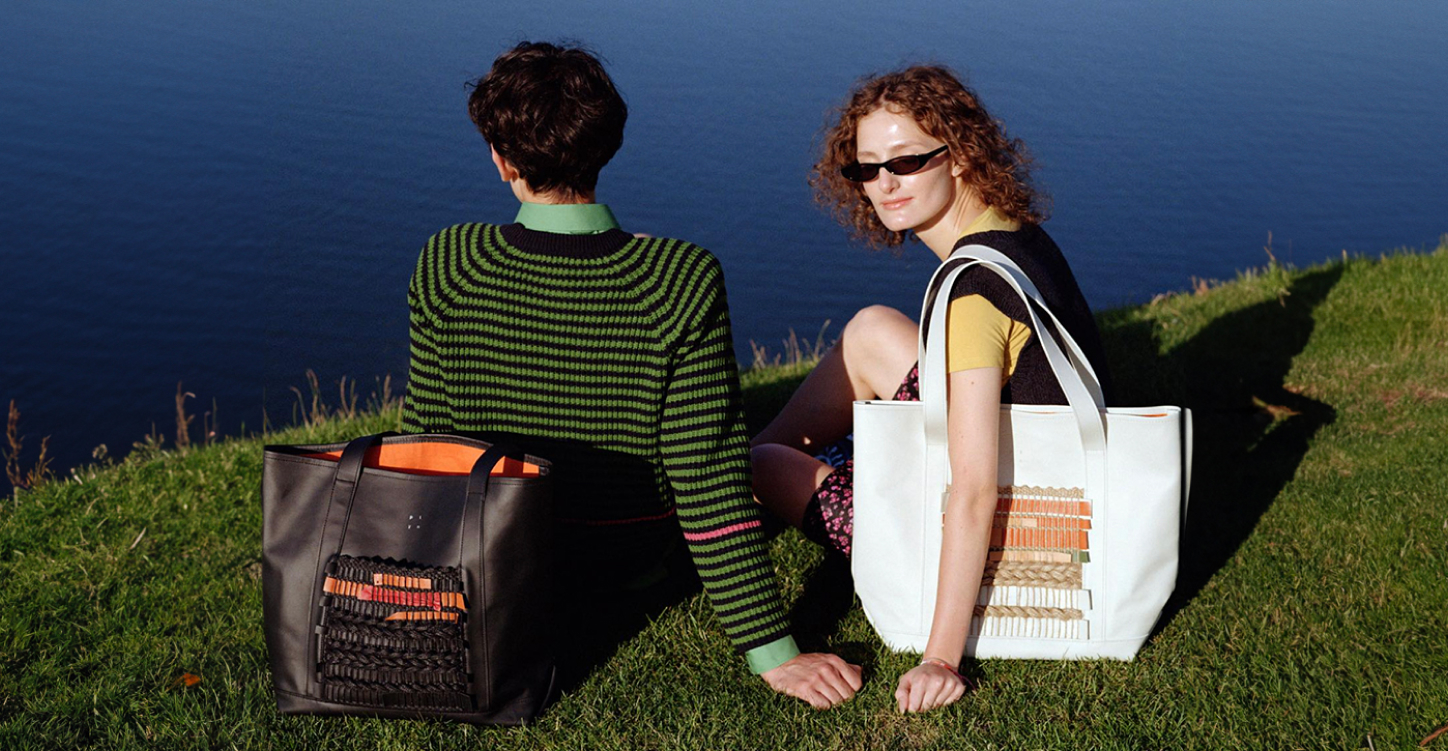
A new name, a new identity, a new brand strategy – Patsany has rebranded the leather accessories brand PLYN.
Background
Patsany were approached by NUB, a craft family-owned and operated manufacturer of genuine leather accessories. The owners have already found an interesting product niche of leather accessories, and it was time to find themselves as a brand. To find a meaningful territory that will become the basis for development, to formulate their values and mission, to understand the character and the vibe, to set the business and communication goals. So, NUB reached out to us for a complete rebranding. And we are Patsany, we are simple: we are asked to rebrand – we rebrand.
The task
To develop a brand strategy, create a new name and identity.
Challenge
The owners wanted to emphasize Ukrainian production and incorporate Ukrainian code into the brand. Patsany had to find a solution that would not be another manifestation of Sharovarshchyna and Bayraktar-core, but would instead organically integrate the topic that was important to the owners into the brand identity, values, and communication.
We set out to create a powerful brand that would be cool not because it is Ukrainian, but because it has a conscious stance, modern communication, and a high-quality product. We planned everything and started implementing it.
We set out to create a powerful brand that would be cool not because it is Ukrainian, but because it has a conscious stance, modern communication, and a high-quality product. We planned everything and started implementing it.
How we did it
Brand strategy
We started with the pragmatic stuff: goals, plans, and numbers. We formulated the main milestones in the brand's life and laid them out on a timeline. Thus, we got a business and brand vision for three years. And then, we jumped into a creative whirlwind to find ourselves as a brand in a valuable and meaningful way.
Big Idea
Patsany kept in mind the main challenge: to find an organic way to emphasize the Ukrainian essence of the brand. The owners are from Nova Kakhovka, so we understood how important it was to find a solution that would make the brand a continuation of the ideas and values of its founders.
We looked around at modern Ukrainians, at what surrounds us here and now. And we realized that these days, we encounter Ukrainian traditions mainly just on holidays: Independence Day, Vyshyvanka Day, or at traditional weddings. As soon as the holiday is over, our embroidered shirts go back into the closet.
We looked around at modern Ukrainians, at what surrounds us here and now. And we realized that these days, we encounter Ukrainian traditions mainly just on holidays: Independence Day, Vyshyvanka Day, or at traditional weddings. As soon as the holiday is over, our embroidered shirts go back into the closet.
Why so?
Looking for an answer to this question, we realized that
we needed to think about how to not just bring the Ukrainian past and traditions into the present in their authentic form, but to rethink them, adapt them to our time and mix them with modern messages
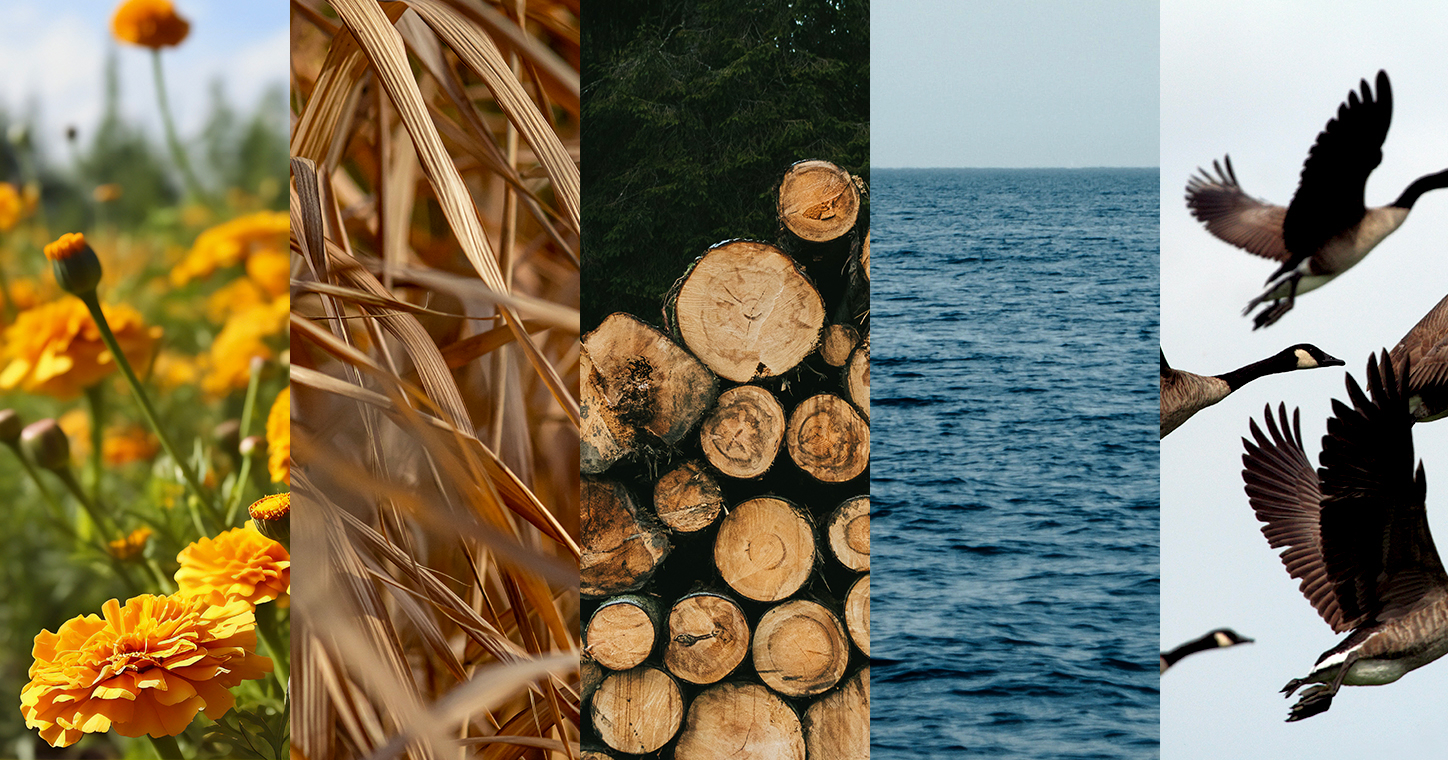
During the research, we saw that Ukrainian culture is rich in various symbols. Since the days of paganism, our ancestors have been putting their own meaning into each of them: prosperity, luck, love, a sense of belonging to a certain community or family. These are time-tested symbols that continue to live on in their authentic visual manifestations and are reborn into new forms and meanings.
This is how Patsany formulated the main idea of the brand: the Power of Symbols
We want Ukrainian culture to be not a fleeting trend, but an integral part of Ukrainian modernity, so that other nations appreciate it. We want these symbols of our identity to be reinterpreted, reborn into new forms, and at the same time remain close to different generations.
Mission
Once the main idea was understood, the mission to make traditional visual Ukrainian culture an integral part of modernity seemed to formulate itself – it was so organic to the brand.
Positioning
Another puzzle in this creative, symbolic, and semantic whirlpool was the brand's positioning: a workshop of symbolic leather accessories. This way, we managed to combine the product and semantic components into one message. We are simple Patsany, we don't like to talk much about ourselves, but we think it turned out well.
Name
When working on the name, we wanted to convey a sense of time, constant movement, change and, at the same time, something that is always there, that will always exist, even when you are gone. We realized that there was no point in literally translating the Big Idea into a name and thinking about verbal forms associated with symbols. This part would be better reflected in the identity. We wanted to put deeper meanings in the name.
Plyn is the new name of the brand
We are the ones who are constantly moving forward, who are not limited by time and space, whose history will not lose its relevance, but will be rethought and reborn in new forms and meanings. This is how Patsany tamed time, and NUB began its transformation into PLYN.
Identity
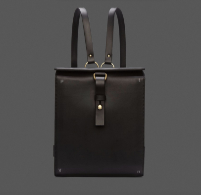
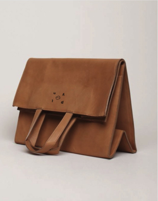
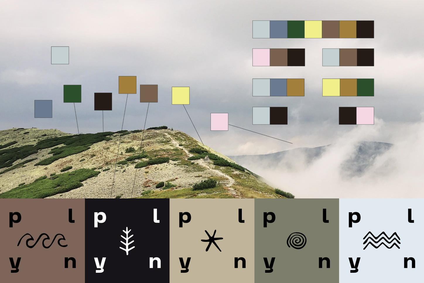
Visual meanings had to be combined with ideological meanings. We identified more than 15 visual symbols of Ukrainian culture and made them the basis of our identity. They interact with various elements, materials, and colors both in the products and in brand communication.


















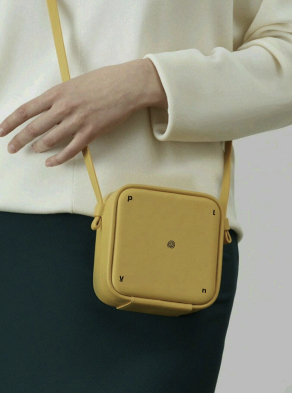
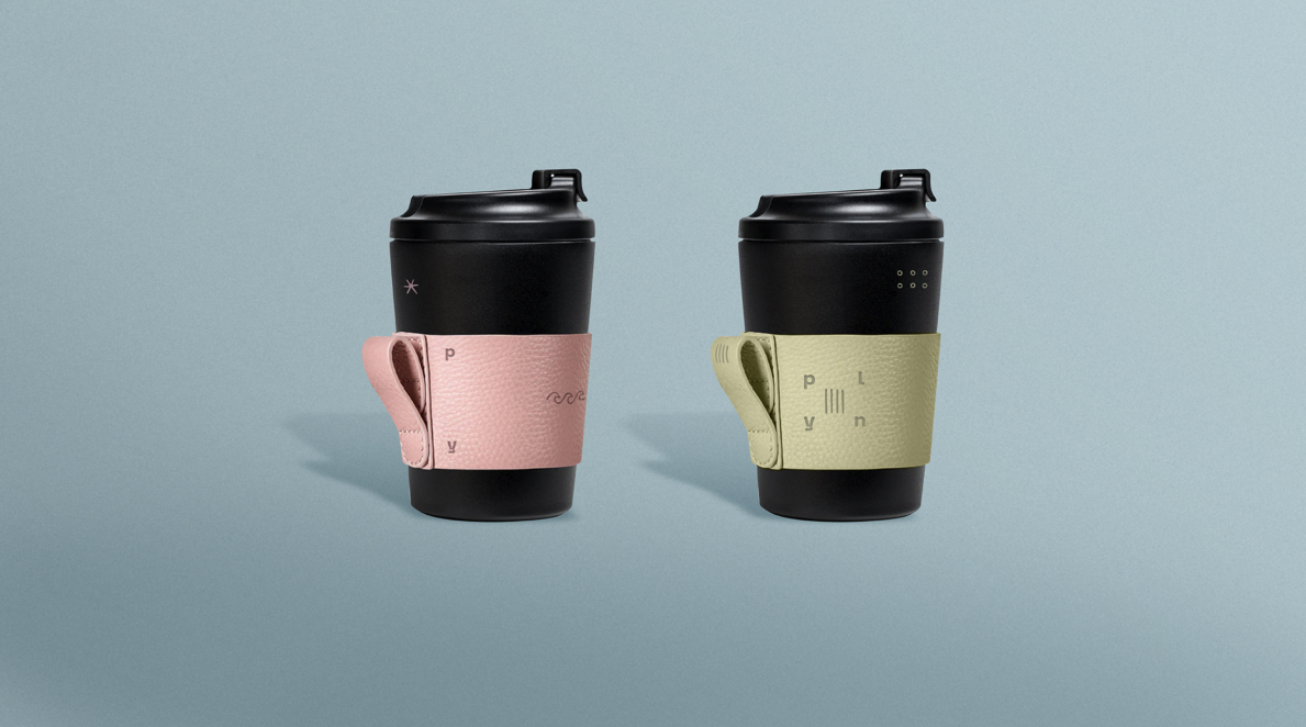
Logo
Patsany have developed a dynamic logo which has given us an unlimited number of its variants. But in each of them, it remains recognizable. The logo organically continues the main idea of the brand – "the power of symbols" – and also reflects the feeling of constant movement, lack of boundaries, eternity in the name: PLYN.
The logo is also shaped like a cube, which seems to preserve the values of the brand and the country, its ancient symbols and traditions. It combines modernity and antiquity.
Color scheme
We have developed a palette where black and white are the main colors, and the accent colors are complex deep shades inspired by nature. In this way, we continue our theme of time and space, our lands and culture. Nature is what was before us, is there now and will be there long after us.
ToV
We have developed the brand's character, voice and ToV so that communication across all channels is an organic extension of our values. We decided to combine the past and the present, the national and the individual, the traditional and the experimental.
To realize these ambitious goals, we based our communication on proverbs, sayings and phraseology. They are used by people of different genders, ages, status, religion and orientation. At the same time, this form is not static: the context of the use changes, intonations change, and new, modern variants and forms are added to reflect our era.
To realize these ambitious goals, we based our communication on proverbs, sayings and phraseology. They are used by people of different genders, ages, status, religion and orientation. At the same time, this form is not static: the context of the use changes, intonations change, and new, modern variants and forms are added to reflect our era.
These are verbal forms that unite Ukraine that existed 100 years ago and Ukraine that exists today.
An example of communication
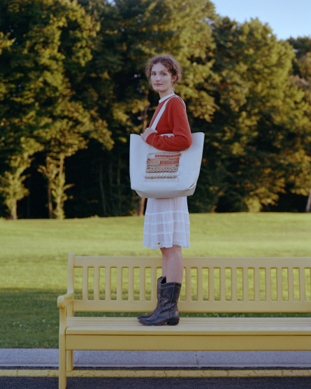
One swallow does not make a spring, but one bag can make a summer. The colors of the Ukrainian harvest were used in this geometric leather bag: sea buckthorn, eggplant and blueberry, or, as they say in Zakarpattia, yafinovy.
For small summer adventures, choose a size of 15×11.5×4.5 cm (2350 UAH). For special events, choose 20×15×4.5 cm (2550 UAH).
Don't fill your tanks with various stereotypes and carry Ukrainian summer with you whenever you want.
Don't fill your tanks with various stereotypes and carry Ukrainian summer with you whenever you want.
What's next?
Patsany rebranded the workshop in the fall of 2022, and managed to realize the plan in the fall of 2023. NUB transformed into PLYN and began to build its new history. The brand has already released an updated line of accessories and held its first photo shoots - it looks great, see for yourself.
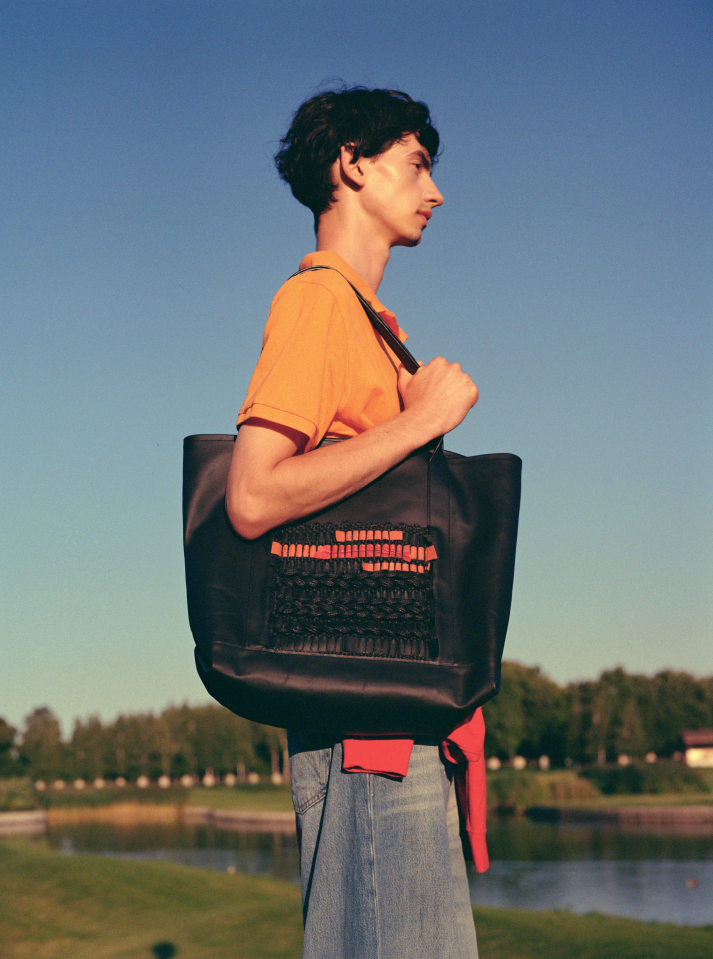
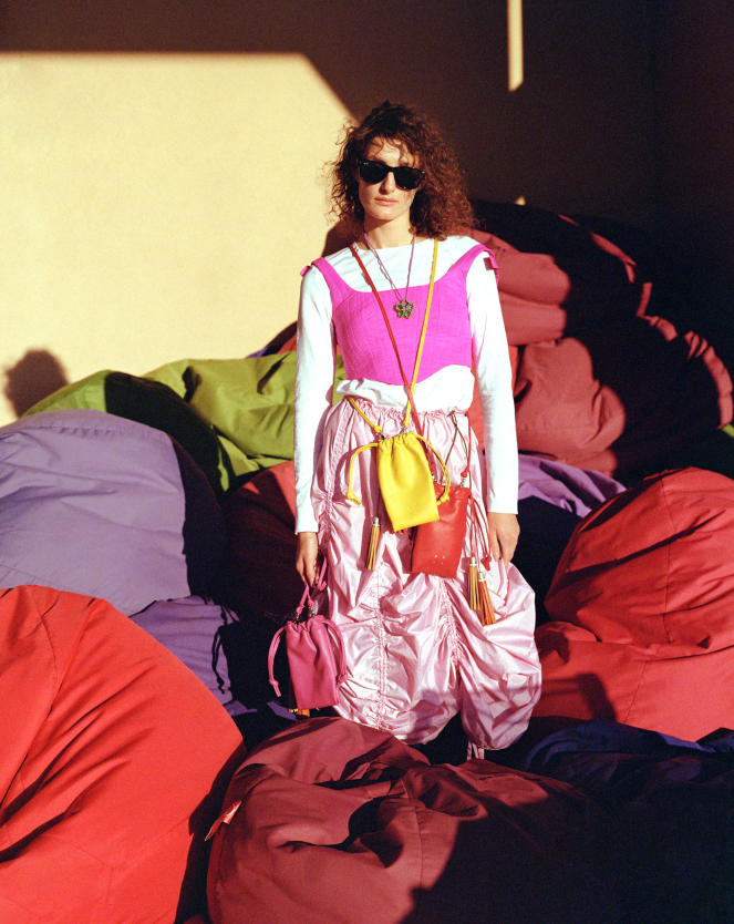
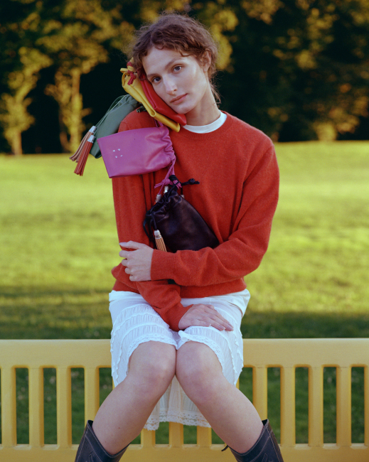
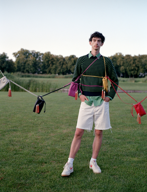
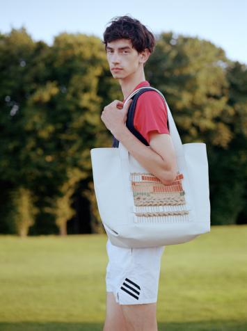
Patsany actively observe the life of PLYN, sometimes even shedding a creative and strategic tear. Life goes on, and it's great.
PROJECT
TEAM
TEAM
PLYN
Alexey Masiutkin
Oleksandra Masiutkina
Patsany Agency
Creative director: Dmitry Yatsyna
Art director: Inna Alimova
Strategic director: Evgeniy Zingerman
Strategist: Maria Vasilenko
Creative copywriter: Sasha Faina
Designer: Anastasia Kovalenko
Proofreader: Vira Semenova
Production
Photographer: Ania Honcharova
Stylist: Viktoriia Zhyr
Hair and Makeup: Ania Zhatko
Modeling Agency: GIRLS GIRLS MGMT, Boys Boys Management
Videographer: Yurii Tuzhylov
Contact Us →
Patsany Agency with love © 2024 All rights reserved